DAZZLING EFFULGENCE RADIATING PURE LIGHT,
OPEN THE LOTUS OF OUR HEARTS I PRAY.
(from the writings of Ramana Maharishi).
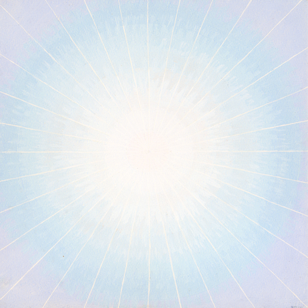
I originally painted the Mandala that I have published and called Pure Light in about 1977. Light is a symbol universally associated with The Centre of Consciousness and the image came to my attention during my meditative explorations. In those explorations an association between inner visual experiences and modifications in consciousness became apparent. In particular intense Light, I found to correlate with deep meditation just prior to transcendence.
I have painted several variations of Pure Light over the years. The process of painting the image and tuning into it has been, and to a certain extent continues to be, part of my meditations. I especially worked with the image in the late ’70s and more recently in the last five years (1990-1995). Painting this particular mandala is primarily inspired by my own inner process, but also it is part of other people’s processes. I have often painted this mandala on commission. It is an image that resonates with many people I have come into contact with. I would say that it is an image that vibrates on a frequency that is conducive to centering and is supportive of meditation.
There are various aspects to this image in basic visual terms. First of all, there is the centre and radiating lines. This inward/outward movement exists in the context of a series of concentric circles which I usually paint blue and provides the background for the rays. There is a definite dynamic between these two factors which can be modified in at least two ways.
The radiating lines can be emphasized and very apparent or can be almost invisible. Similarly, the background colour can be strong or very subtle. When I first worked with the image in the ’70’s I was fascinated with the idea that at a certain point an image or energy becomes so subtle that it almost disappears. In ’76 I wrote the following which expresses this sentiment:
Whether it is poetry, art or music,
Mystical expression is very close to dissolution.
When there is dissolution,
The One is attained.
Mystical expression is very concise.
The simplest words Contain the most essence.
(Dorset 1976)
So at that point in time, I painted some versions of Pure Light in very pastel colours. In most cases the background colour was blue as for me that is the colour most strongly associated with the transcendent. However, there are quite a few blues to choose from in terms of paints available, and I especially liked the effect of moving through the spectrum from green-blue (turquoise) to blue-blue, to red-blue (violet) in very pale shades. I also explored the introduction of pink because it seemed to convey a tender feeling quality to complement the spaciousness of the blue. Also in the original Pure Light, the rays are yellow, but the colour is so subtle that the printing process does not register it. From the standpoint of the printing press, the colour of the rays is indeed invisible!
In the early ’80’s I continued to paint mandalas and explore the principle of light and radiation in several mandalas some of which I have published, but I ceased to work specifically with variations of Pure Light. For instance, I painted the mandala that I have called SUNSTAR.
Sunstar has a strong radiation of light as in Pure Light but has a more definite form (six-pointed star) and a greater movement through the spectrum. All the mandalas that I have painted correspond to inner processes that I am experiencing and exploring.
Painting the mandalas is part of focusing on the process involved and also opening up to the creative flow and inspiration.
When I came back to painting variations of Pure Light in the early ’90s, thirteen years after I first painted in in ’77, I had meanwhile undergone certain changes in consciousness. I would say that these changes were relatively small compared to the major shift I experienced earlier in my life, but nevertheless they were significant. Stated simply, the emphasis for me had moved from transcendence, which is in a sense a movement upwards, to the reverse process. The emphasis had moved from the upward-pointing triangle to the downward-pointing one and their integration. This was and is a balancing process which is part of the ongoing centring journey. This had implications in terms of my use of colour which brings me to Shunyata.
The Mandala that I am calling SHUNYATA has come together in the last year and a half (1994-5) and was in response to a commission that evolved out of a three-way discussion. The original version of Shunyata was in the same colours as the original Pure Light but differs in that the background is circular rather than square. A later evolution that relates to the mandalas that I’m calling Shunyata Colour Light Variations is another discussion which led to a commission involving painting six versions of Shunyata in the primary and secondary colours.
I have now done this and have a series of versions of Shunyata painted in different colours. This is an exploration of how the energy and effect of the image change with different colours and it’s possible use in the context of colour healing.
